Showing posts with label 32 Ident Production. Show all posts
Showing posts with label 32 Ident Production. Show all posts
Wednesday, 22 June 2016
32 - Styles, Conventions & Techniques in Music Video
When it comes to music videos a lot of artists make them for there fans, but some artist make them to shock people and to get more views on there music videos.
The first music video that I will be analysing is ‘Sacrilege’ by the band Yeah Yeah Yeah’s, I think this music video is a narrative style, because it is telling a story but in a really creative way by making it go backwards, so it starts off with the music video showing a girl who is being tied to a post getting ready to be burned to death, and it starts to go backwards answering the question as to why she is going to be burned to death and it is really clever how they made it so it starts with the ending and then the middle and then the start, not a lot of music videos go for this style. It is also voyeuristic showing the woman being intimate with other men and also with a woman, which will draw a lot of attention. The genre of the music video I would say is realistic because the woman in the music video is cheating on her husband with other people which is something that happens all the time and it is very relatable it is also dramatic because of the events that are happening with the getting ready to burn the girl because she cheated.
The second music video that I will be analysing is ‘Adore You’ by Miley Cyrus (http://www.youtube.com/watch?v=W1tzURKYFNs), the music video is very voyeuristic, this is because Miley is in her bed touching herself and not wearing a lot of clothes, and there are some shots where the camera goes to intimate places, some of the scenes that are shot are by Miley Cyrus herself with a camera that is shown in bits of the music video. Later on in the music video it shows Miley in a bathtub lying down and also doing some intimate things in that as well.
For ‘Sacrilege’ by the Yeah Yeah Yeahs (http://www.youtube.com/watch?v=jmRI3Ew4BvA) I think the music video is consolidating the songs meaning, the songs title ‘Sacrilege’ means ‘Violation or misuse of what is regarded as sacred’, which the music video is really telling with the woman violating the vows of her marriage with her husband by cheating on him with several men and a woman. The lyrics in the song are saying what happened while the music video is showing the story to people.
I think with 'Adore You’ Miley is singing about a guy who she adores and is getting married to but in the music video she is filming herself in intimate places which kind of seems like she adores herself as well, it is like she singing about one thing but interpreting something else, the complete opposite, which will most probably be just to get more views and to get more people listening to her songs.
The techniques that were used in the 'Sacrilege’ music video weren’t like most music videos, the band didn’t star in it so there wasn’t any lip-syncing involved in it, but most of the scenes that took place were cut to the beat of the music. The majority of the techniques revolved around the camera movements and camera angles, the camera movements were mostly still and smooth but there are also moments where it is handheld to bring more drama into the music video, there were close up of different characters in the music video when showing them with the main character, but most of the other camera angles were wide shots to show what was happening in the scene.
The techniques used in 'Adore you’ are lip syncing which is done by the singer herself in the whole music video. The camera angles that are used in the music video are mostly close ups, when Miley is filming herself she goes really close to the face and to some intimate areas as well, also in some of the scenes that she shoots are shot in nightlight kind of picture in some scenes, and in other scenes where it is further away from Miley you see her actually filming herself with the camera in her hand. The camera movements aren’t very steady they are handheld and they are moving from being close to Miley to being further away.
Understanding Television Idents
Purpose & Design
Television Idents have been around since the early 1950’s, they were a way of identifying different channels by there logo in 15 seconds or less, since they didn’t have all the new technology that we have today they only showed a logo in black and white and with no moving images, the BBC’s first ident was recognisable and everyone nicknamed it ‘Bats Wings’, whereas now they have developed into colourful short films weather they are animated or real life imagery, that people can recognise to be with a certain channel and also to stand out to people and be different from the other idents for different channels, as well as giving the audience some insight on what type of programmes the channel airs.
E4 has been a companion channel to Channel 4 since 2001; they are a entertainment channel aimed at people between the ages of 15-35 years old as they show programmes like ‘2 Broke Girls’, ‘Hollyoaks’, ‘How I Met Your Mother’ etc. The idents for E4 are mostly animated, some are a mix of animation and real life imagery, and some of them can be inappropriate for people who are younger than the target audience’s age. In 2001 when E4 started the idents weren’t that different from what they are today, the first ever ident was of the E4 sign causing havoc breaking down the set and breaking the channel 4 sign which shows that E4 airs shows that are more inappropriate than what channel 4 airs. Since then they have developed to be more comedic and also have real life imagery involved in some of their idents. The ident that I choose to look at was a popular one that everyone knew about and whenever it came on they couldn’t help themselves but sing along to it (E4 - My Kingdom For A Horse) This is a very good example of the idents that E4 shows on there channel as well as it being recognisable as the E4 colours of purple being involved in the ident as well.
Another example is the crime scene idents by FX, these idents not only promote FX with the red squares flying around that represent them but it also promotes the type of programmes that they air, the ident shows the red squares flying around a crime scene showing tape and holes in a wall until they form themselves on the floor making a body shape before showing the actual FX sign at the end (FX - Crime Ident). The red squares floating around are recognisable for the viewers of FX as it is the red square the FX sign is actually put on.
Opportunities
Idents are a way of promoting a TV channel, and also a way of showing what the channel has to offer for the target audience and a creative way of gaining more people watching that channel. When ITV was re-branded they changed there logo to be more colourful this is to show the wide range of different programming that they show, it also made it so they could make merchandise with this logo. 4Music idents are another good example as they are colourful and they always have two people dancing together to new music before showing the 4Music sign at the end, this is promoting that they play music and it is also goes with there target audience of 16-25 year olds (4Music - Dance).
Limitations
There are some limitations when it comes to idents, the typography has to be readable to the audience as well as appealing to the eye so the audience can recognise it, but also it has to be reflecting what type of channel it is for example CBBC is a channel for young kids so the font for each letter is different with there signature colour of green around the letters, BBC Sport o the other hand is all in the same font and is big and bold surrounded by the colour yellow, it is a more serious logo. When logo’s are up on the screen they have to have enough time on the screen for the audience to read as well as if it is moving it has to be moving slow enough for the audience as if it is going to fast it will be to blurry and hard to read. The size is also a big thing as you want to make sure that the whole logo fits into the screen of the television as some people have smaller televisions so they can be cut off to, the aspect ratio is for televisions now are 16:3 - 4:3, which means the logo has to be between those two otherwise people won’t be able to read them without it getting cut off.

Creative Communication
Over the years idents have developed a lot from just a black and white picture on a screen to colourful moving images, BBC One is an example of the change in idents their first ident was an image of the globe in blue and green and the logo at the bottom, now BBC One has kept the circle to represent the world but it has now changed to movie imagery making the circle, for example hippos swimming in a circle, surfers under a wave ect. with a voice over involved telling the audience what programmes will be coming on. Keeping the circle for the world involved in the idents is a way for the audience to still recognise the channel.


People who are apart if making an ident have a deadline for when they want the idents to be aired, they have to make sure that they meet the deadline otherwise they could lose money. When it comes to budgets it is hard to create an ident if the budget is low as it means they have to be careful with what they purchase and to make each penny count whereas if they had a big budget they wouldn’t have to worry as much as it gives them the freedom to be able to purchase things to be involved in the ident without being too worried that they could go over their budget. It’s important when creating an ident that you remember that it has to appeal to that target audience so if it was an ident for Cbeebies than it would have to be colourful and fun for the young kids that watch that channel, or if it was an ident for BBC Three than it would have to be comedic and appealing to young adults.
SCHEDULING AND SEASONAL IDENTS
For videos see here: http://kwoodtvidents.blogspot.co.uk/2012/09/scheduling-and-seasonal-idents-13912.html
Most TV channels have specific idents for different times of the day or different times throughout the year.
For example, whilst analysing TV idents I have found that most children's channel idents are based in daytime settings (the channels are off air at 7pm). The different sections of the ident are set in daylight, and the familiar characters in the ident confirm the viewer is on the right channel.
Alternatively, BBC three (which comes on air at 7pm) idents seem to have a dark/night time theme and often show lights being turned on etc. The 'nightlife' themes are more suitable for a young adult target audience. The make up, shoes, dancing and music, also reflects the nightlife idea.
TV idents are also often modified for seasonal occasions, such as christmas, spring and halloween.
Christmas, BBC 2 :
Spring, Cartoon Network Europe:
Most TV channels have specific idents for different times of the day or different times throughout the year.
For example, whilst analysing TV idents I have found that most children's channel idents are based in daytime settings (the channels are off air at 7pm). The different sections of the ident are set in daylight, and the familiar characters in the ident confirm the viewer is on the right channel.
Alternatively, BBC three (which comes on air at 7pm) idents seem to have a dark/night time theme and often show lights being turned on etc. The 'nightlife' themes are more suitable for a young adult target audience. The make up, shoes, dancing and music, also reflects the nightlife idea.
TV idents are also often modified for seasonal occasions, such as christmas, spring and halloween.
Christmas, BBC 2 :
This ident has a winter theme featuring snow, ice and deer.
This ident has a spring theme as it focuses on the growth of new plants and flowers. The animations/movement reflect the idea of growth.
Halloween, Disney Channel:
This ident has a halloween theme featuring halloween iconography such as pumpkins, graveyards and witches.
PACKAGING AND RE-PACKAGING
For videos see: http://kwoodtvidents.blogspot.co.uk/2012/09/packaging-and-re-packaging-12912.html
One of an idents main purposes is for identifying, branding and marketing.
One of an idents main purposes is for identifying, branding and marketing.
Eventually, this branding will become 'out of date' or will no longer serve the original aims and purposes of a channel. Alternatively, the audience and target market may change as the company develops.
To look at how a channel's identity has changed we can compare an old and new ident.
Eg.1. Channel 4
CHANNEL 4 IDENT 1982
CHANNEL 4 IDENT 2004
Mission statement: 'Do it first, make trouble and inspire change'.
Channel Aims (redefined 2003):
- demonstrates innovation, experiment and creativity in the form and content of programmes;
- appeals to the tastes and interests of a culturally diverse society;
- makes a significant contribution to meeting the need for the licensed public service channels to include programmes of an educational nature and other programmes of educative value; and
- exhibits a distinctive character
The original ident in 1982 does not reflect the channels aims well. It is very simple. However, it does use bright colours, which reflects the creativity aims. Also, the theme music used in the 1982 ident became very recognisable to the channel. The 'coming together' animation of this ident was established in the 80s but is still used in today's modern idents.
The modern 2004 ident reflects the channel's aims much more effectively. The modern Japanese city setting demonstrates innovation. The bright colours represent the creativity aim. The fact the ident is set in a different country and shows a different language 'appeals to the tastes and interests of a culturally diverse society', which the previous ident did not do. The familiar 'coming together' of the number 4, distinguishes the ident to the channel.
Eg.2. UKTV Gold
UKTV GOLD IDENT 2004
UKTV GOLD IDENT 2012
UKTV GOLD was launched in 1992, and has been 'repackaged' a number of times. The channel is primarily a comedy channel.
About GOLD: 'Dedicated to celebrating great comedy and entertainment, Gold is the nation's favourite comedy channel. Its wealth of classic comedy programming is guaranteed to make viewers laugh daily. Much-loved comedy series such as Only Fools and Horses, Vicar of Dibley and Outnumbered sit alongside our brand new commissions featuring all the big-name stars, including Fry and Laurie: Reunited and The Royle Family Portraits.'
The channel's main aim is to entertain and make viewers laugh. This aim should be reflected in the TV ident.
The ident from 2004 does not seem to fit the aims of the channel. It consists of clips of someone washing up. In a way the ident could reflect everyday life of the British nation. There is some laughter sounds in the clip which hint at the channel's genre. Finally, the logo shown at the end is surrounded by a gold colour scheme, identifying the channel's branding/name.
This gold colour scheme has since been lost in the new 2012 TV idents. The channel's name was also cut down from UKTV Gold to just Gold, which is perhaps more effective. The new TV ident is very bright and busy with some comical objects/words. For example the boxing glove at the beginning, carrot, wind up teeth etc. The phrase 'stick something funny on' is used throughout this ident signifying the channel's genre. I believe, the new ident is more entertaining and suitable for the channel's aims.
This gold colour scheme has since been lost in the new 2012 TV idents. The channel's name was also cut down from UKTV Gold to just Gold, which is perhaps more effective. The new TV ident is very bright and busy with some comical objects/words. For example the boxing glove at the beginning, carrot, wind up teeth etc. The phrase 'stick something funny on' is used throughout this ident signifying the channel's genre. I believe, the new ident is more entertaining and suitable for the channel's aims.
AUDIENCES
Broadcasters will split up the mass amount of people who watch television into categories.
They do this to measure their audiences and create or alter programming to target these specific groups.
There are two main methods of categorising an audience known as demographics and psychographics.
Demographics are more statistical characteristics of a population/audience, including, age, gender, race, socioeconomic status etc.
Psychographics focus on the study of personality (psychology). This includes values, attitudes and life styles. Also known as VALS.
There are multiple establishments which categorise audiences.
The first is VALS. (http://www.strategicbusinessinsights.com/vals/presurvey.shtml)
VALS stands for values, attitudes and life styles.
'VALS is a consulting and consumer research service'.
VALS uses a 40-question survey to explore/categorise audiences. Questions include, income, fashion, demographics etc.
Another establishment is BARB. (http://www.barb.co.uk/)
BARB stands for broadcaster audience research board.
'BARB is the organisation responsible for providing the official measurement of UK television audiences.'
BARB electronically measures data second by second. Television recordings or plus one are not taken into account. Data is collected from 5,100 homes.
 An example of weekly viewing figures from 'BARB'. Channels with less views, perhaps have less effective idents/branding, making them less well known.
Another organisation is ACORN CACI. (http://www.caci.co.uk/acorn-classification.aspx)
This website understands its customers due to the area you live in.
Upon registering to the website you can enter your postcode to find out about the socioeconomics of your street. Categories include wealthy achievers, urban prosperity and comfortably off.
Finally another establishment is 4CS. (http://www.4cs.yr.com/global/)
Young and Rubicam's 4Cs Values Segmentation. The 4Cs stand for Cross Cultural Consumer Characterisation.
 These are the Young and Rubicam lifestyle categories. The categories separate an audience by age, gender, class and interests.
It is a service which aims to categorises people into stereotypes and categories such as; security, control, status, individuality, freedom, survival and escape. This service is based upon Maslow's hierarchy of needs.

They do this to measure their audiences and create or alter programming to target these specific groups.
There are two main methods of categorising an audience known as demographics and psychographics.
Demographics are more statistical characteristics of a population/audience, including, age, gender, race, socioeconomic status etc.
Psychographics focus on the study of personality (psychology). This includes values, attitudes and life styles. Also known as VALS.
There are multiple establishments which categorise audiences.
The first is VALS. (http://www.strategicbusinessinsights.com/vals/presurvey.shtml)
VALS stands for values, attitudes and life styles.
'VALS is a consulting and consumer research service'.
VALS uses a 40-question survey to explore/categorise audiences. Questions include, income, fashion, demographics etc.
Another establishment is BARB. (http://www.barb.co.uk/)
BARB stands for broadcaster audience research board.
'BARB is the organisation responsible for providing the official measurement of UK television audiences.'
BARB electronically measures data second by second. Television recordings or plus one are not taken into account. Data is collected from 5,100 homes.

Another organisation is ACORN CACI. (http://www.caci.co.uk/acorn-classification.aspx)
This website understands its customers due to the area you live in.
Upon registering to the website you can enter your postcode to find out about the socioeconomics of your street. Categories include wealthy achievers, urban prosperity and comfortably off.
Finally another establishment is 4CS. (http://www.4cs.yr.com/global/)
Young and Rubicam's 4Cs Values Segmentation. The 4Cs stand for Cross Cultural Consumer Characterisation.

It is a service which aims to categorises people into stereotypes and categories such as; security, control, status, individuality, freedom, survival and escape. This service is based upon Maslow's hierarchy of needs.
It would be useful to use data from these websites to relate a TV ident to an audience and a channel's missions/aims.
ANALYSING TV IDENTS
To analyse a TV ident you need to look at how it moves and any messages it portrays.
You could also look at:
- place or time the ident is set
- the tempo or speed
- how it interacts with the audience (breaks fourth wall/direct address)
- is it informative or purely entertainment?
- does it have density?
The design of the ident should relate to its overall purpose: to advertise and communicate.
1. MTV CLASSICS IDENT
0:26-0:36 seconds
MTV Classics is a 24 hour music channel which was launched in 2010 which plays music from the 60s to present day. The setting of the ident starts in an office with computer equipment which looks dated (70s-80s) and changes to into a 'cyberspace'. The ident has a retro style theme.
The ident has a very rapid tempo/pace. The ident is mainly for entertainment and would not immediately be recognised as a music channel ident. However there are subtle hints at the Channel's genre eg. the ident starting in the past (old computer technology) and then cutting to the modern futuristic cyberspace part relates to the old and new music the channel plays.
The ident is colourful and eye catching with some 3D shapes giving it density.
The ident could portray that the channel is for young people because of the technology and gaming theme and the electronic music used.
The channels logo is then shown at the end of the ident, the logo is animated slightly. The ident is innovative as it takes the audience from the past to the future.
| MTV Classic logo |
2. E4 LOADING BAY IDENT
E4 is a british TV channel launched as a second channel to Channel 4 in 2001. The 'E' stands for entertainment and the channel is mainly aimed at the 15-35 age group.
The setting for this ident is garages/a loading bay. The household items shown in the ident eg. Microwaves etc show that the ident is set in modern times. The tempo of the ident is moderately fast and it fits with the tempo of the music.
The ident features many different objects eg. home electronics, furniture, animal figures and musical instruments. which could perhaps could reveal that the channel has a variety of different programmes and would appeal to a variety of different people.
The ident is purely for entertainment as not much information about the channel can be gathered from it. The E4 channel branding is placed upon the crate objects in the ident. Finally, the 'shove it up your tellyhole' pun which can be seen at the end is comical and would appeal to a younger audience.
3. MTV HITS IDENT
MTV Hits is a 24-hour music channel, playing mainly pop music videos (top 40) and was launched in 2001.
These ident feature animated characters. The fact it is animated shows that it is a 'modern' channel. The tempo of all the idents is fast-pace and the music used reflects this.
Again these idents are mainly used for entertainment purposes, but by looking further into the 'character's personalities' we can find out some information about the TV channel. For example, the first few idents feature characters moving/dancing in sync almost like choreography. At 0:36 the characters reflect a 'boy band' and at 0:48 the two characters are a 'rapper' and 'diva' type. These can suggest the type of bands/artists that will be played on this particular channel.
The idents are bright and colourful and the colours/shading on some of the characters gives the ident a 3D feel. The shape and movement of the characters could resemble the equaliser bars on a CD player. This subtle reference to elements of sound relates to the channel's theme.
The MTV Hits logo is shown at the end of each ident and is animated slightly.
| MTV Hits logo |
4. SKY MOVIES TV IDENT
'Sky Movies is the collective name for a group of subscription television movie channels. It has around 5 million subscribers, via satellite and cable, in the UK and Ireland.'
The ident is purely for entertainment as it grabs the attention of the audience. It has a quizzical element, as at first glance it is not obvious it is an ident and keeps the viewer watching.
The ident consists of different landscapes from different film genres being shown in a slow/smooth panning style. The choice of music fits with the ident tempo and what is happening on-screen.
The different film genres shown relates to the type of audience the channel appeals to. From the demographics of the channel (shown below) and the ident it is clear the channels target market is families.
 |
| Sky Movies Demographics |
5. MTV 'ORGANIC' IDENTS
MTV is an American cable television channel based in New York, that launched on August 1st 1981. The initial purpose of the channel was to play music videos. Today, MTV primarily broadcasts a variety of reality and scripted television shows.
It's target market is adolescents and young adults. This target market is reflected through the ident.
The settings used relate to the youth audience eg. use of graffiti. The use of local-looking scenes could also be recognised as places where the youth like to socialise, again appealing to the target market.
The settings themselves are not dense but empty wasteland spaces. The idents density comes from the animated logo itself. The idents are very well made as the animated logos create shadows on the floor to give the impression they are actually present.
The oriental sounding music and origami inspired logos relate to different cultures and audiences.
One of MTV's main objectives is that it remains a constantly growing channel. This relates to the way the logos move, the unfolding/getting bigger animation reflects growth. Finally, the suite of idents is named 'organic', this again reflects the companies ambition for growth.
6. CBBC IDENT
CBBC is a children's television channel created by the BBC. The channel is aimed at children from 6-12. The channel currently broadcasts 12 hours a day, between 7am and 7pm.
The ident has been created to suit the target audience. Firstly, the ident is comprised mainly of animated 'daytime' settings, this represents the time of the day the channel is on. Also, young children often fear the dark so including this in the ident may have a negative effect.
The ident is very energetic and fast paced, which is appropriate for the target market. The ident would keep the viewer happy and entertained, and is short enough to hold the attention of young viewers. The ident also reflects a child's imagination and dreams.
The ident contains some familiar characters from the channel, which gives the viewer confirmation that they are watching the correct channel, this is important for young children.
The colour palette used is bright with the typical vibrant green which is familiar to the channel.
7. SKY NEWS IDENT
Sky News is a 24-hour British and international satellite television news broadcaster. The channel focuses on rolling/breaking news. The ident is effective in portraying the channels genre and identity.
The ident is both entertaining and informative. It includes different viewing devices for example an iphone and ipad, to show an audience alternative ways to watch the channel.
The ident is futuristic in its style, showing the channel is current. Density is created by the sophisticated metallic textures used.
There is no setting for the ident, it is based in 'cyberspace' again showing aspects of modern day. The ident colours are dark/black reflecting that the channel is not aimed at a young audience but for an older, adult audience.
8. BBC 3 IDENT
BBC Three is a television network created by BBC and launched in February 2003. The channels main target audience is aged between 16 and 34. The channel is on-air from 7pm up to 5am each night.
One of the channel's main purposes is to 'provide 'innovative' content to young audiences focusing on new talent and new technologies.'
Another of BBC Three's aims is 'Bringing the UK to the world and the world to the UK'. This aim is reflected in the ident's visuals, based in space/on the earth. The ident also appears to be set in a city environment. Diversity is shown through the different characters used in the ident.
The objects/characters in the ident relate to the different types of programmes shown on the channel. For example. shoes, for fashion programmes and a diver/swimmer to represent the sports programmes.
The ident is fast paced and has appropriate music to match this, again appealing to the younger youth audiences.
9. BBC 2 IDENT
BBC 2 is the second TV Channel operated by the BBC in the UK. BBC 2 is thought to show more 'highbrow' or intellectual programmes (eg. QI and University Challenge) and is aimed at an older audience.
The BBC's main missions are:
'To enrich people's lives with programmes and services that inform, educate and entertain.
To be the most creative organisation in the world.'
The ident is set in a coffee shop environment which reflects the average persons life/social life. ('Enrich people's lifes'). This can subtlety be direct address with an audience, as the coffee cup image would be recognised by anyone.
The main focus of the ident is around the number 2, to establish the TV channel and branding.
The tempo of the ident is quite slow and relaxed. This is suitable for the 'daytime' television programmes the channel tends to show. The ident uses interesting camera work and viewpoints eg. panning/zooming out and looking at the 2 from within another 2.
The different shapes and textures used eg. the powder/foam textures give the ident density. The ident is creative which reflects the channel's aims.
32- H/W 2: UNDERSTANDING THE PURPOSE AND DESIGN
| The purpose of a TV ident is to communicate/identify a particular TV channel or station and its branding easily to an audience. The design of the ident should relate to its overall purpose: to advertise and communicate. |
TV idents are developed so that the branding becomes familiar and recognisable to the audience.
The Media (TV) categorise audiences into social economic status (class) and age groups. eg. ABC1 16-44s. eg. Table below
 |
| Table showing social categories |
32 - H/W 1: WHAT IS A TV IDENT?
- A TV ident is an animated logo which shows branding of a TV channel.
- As there are many different channels and another purpose of an ident is to make a channel stand out against other channels.
- The purpose of an ident is to provide information to an audience about the channel. Most of the time it is just subtle information to confirm the viewer is on the right channel.
- As well as informing a viewer, another purpose of an ident is to entertain.
- Idents can also drive sales through increasing viewing figures. If an ident is made effectively it could attract more audience. E.g if somebody does not normally watch a channel, an ident could grab the attention of new, potential viewers.
 |
| BBC THREE IDENT EXAMPLE |
 |
| CHANNEL 4 IDENT EXAMPLE |
OPPORTUNITIES AND LIMITATIONS
On-screen graphics are designs/drawings/illustrations/graphs used on screen.
There are many opportunities and limitations of on screen graphic representation.
Graphics are used for a number of things:
There are many opportunities and limitations of on screen graphic representation.
Graphics are used for a number of things:
- Adverts
- Idents
- Title Sequences
- Info-graphics (information based graphics)
- Olympic games/formula 1 - and other major sporting events
- Title menus (used on DVDs etc)
 |
| On-screen graphic of F1 car |
Simple graphics were first created in the 1950s by MIT (Massachusetts Institute Of Technology). Computer graphics became more popular in the 1980s.
The first TV ident for Channel 4 was designed by Lambie-Nairn. http://www.lambie-nairn.com/
Before the 80s, Television idents did not exist. There was no need for them as there were not many television channels to choose from. The first time on screen graphics were needed on a wide scale was for the General Election in 1992. These graphics were used to represent seats and voting. Nowadays, there is more need for television idents to distinguish between hundreds of channels.
These graphics would have taken up to two years to produce. They were created using Quantel Paintbox. The graphic designers would have to be artists and physically draw out each frame. E.g A 10 second sequence would need 250 images (25 frames a second). The hand draw images would then need to be filmed in a sequence. Due to software advances, this process is a lot quicker now for modern graphic designers.
 |
| Quantel Paintbox |
The limitations of these older graphics were:
- Bad quality
- Time consuming (hand drawing/filming each frame)
- Expensive (pay employees for longer working hours/expensive equipment)
Despite the limitations at the time these new graphics were quite impressive.
Despite dramatic changes in Graphics technology, there are still some limitations:
- Graphics are still time consuming, taking weeks to produce.
- On-screen graphic production is still expensive, computers/machines and softwares are very costly.
- Another limitation is that colour palettes/trends are frequently changing.
- Fonts used for on-screen graphics can not be made bigger (if used on bigger screens) as they will begin to pixelate.
- Suitable typography would need to be used so that information can be read easily but a varied audience.
- There are still issues with certain colours used on screen. E.g vibrant reds do not transfer from computer to television screens well and are prone to noise and distortion. The RGB (Red, Green, Blue) colour model is additive, so to change a colour you must 'add' a colour. The RGB colour model is usually used on-screen. The CMYK colour model is subtractive, so colours are extracted to make new colours. CMYK (Cyan, Magenta, Yellow and Key/Black) is mainly used in printing. Software such as Adobe have their own versions of these colour models.
 |
| RGB/CMYK differences |
 |
| RGB AND CMYK colour models |
- Television screens have an aspect ratio of 4:3, and are rectangles, whereas some computer screens used to create the graphics are square. This is inhibiting for a graphics designer because all graphics must be in the rectangle/landscape format. (Modern flat-screens are 16:9)
 |
| Aspect ratio |
- There are also problems with resolution. Computer screens may have a high resolution than some of the publics TVs. This would cause the graphics to look worse quality on TV.
- Sections of society have older technology and so graphics will not be appreciated on older TVs.
- It seems software and computer's technology is moving too fast for TV technology.
- Another issue is moiré fringing. Moiré fringing is an interference on screen which occurs when two grids/sets of fine horizontal lines are laid over each other at a slight angle and they move. This problem usually occurs with interlaced video production. The interference occurs if you film something with lines. e.g. some television shows advice members of the audience against wearing fine striped clothing/houndstooth patterns. Video showing moiré pattern: http://www.youtube.com/watch?v=msWLCMxnoBo&feature=relmfu
 |
| Example of moiré interference in photography |
The opportunities of on screen graphic representation are:
- As more TV channels were introduced, these channels would need to have branding to be recognised. So idents became more popular. The more channels there are the bigger the audiences which brings in more money for a company.
- Different idents could be produced for these new channels which cater for different audiences, such as Channel 4 for teenagers.
- On-screen graphics could encourage brand loyalty, which is built over a number of years if the graphics remain the same. If a companies mission statement and values remain the same they will maintain an audience. This loyalty could be built through familiar TV idents. An example of this is the BBC 1 ident. The globe/world/circle shaped motif's in the centre of the ident can be recognised worldwide, however the circle shape is more subtle in some of the idents. It represents that the company is well established, non biased, trusted and an international brand. Also, the BBC's mission statement has remained the same for many years: 'Inform, Educate, Entertain'.
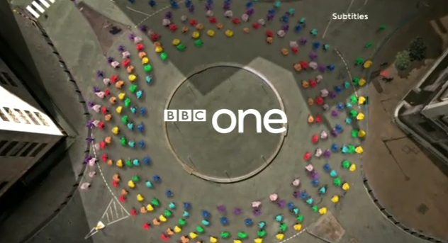 |
| BBC ONE 'Globe' ident |
- Another opportunity is the creation of tone through on-screen graphics. The tone of an ident or graphic can be established by colours, music and the tempo. The tone of the ident contributes to the branding and target audience of a company eg. young, old, formal, informal.
- Branded content gives clothing/technology and other establishments the chance to advertise products subtly through on-screen graphics. eg. a group of people wearing a particular brand of shoes (Converse).
- On screen graphics can also communicate numerical, statistical and text-based information to an audience, which is useful for services such as the News. They also make potentially boring information appear more exciting and interesting. Finally, they could make complicated subjects easier to comprehend.
 |
| Communicating information on a News channel |
Creative communication:
- Enhancing ideas/pushing the ideas: As television technology advances, there are more opportunities for innovative and impressive television idents. For example 3D television idents.
- Communicating visual ideas to a non-visual audience: Idents and adverts could cater for a non-visual audience through the volume of the audio and a detailed description of what the ident is for. e.g. most channel 4 idents have audio explaining the running order for shows.
- Creating under pressure of time and budgets: For most companies creating an ident the designers must have time and budget pressure, to make sure they achieve deadlines.
- Appealing to the target audience: Idents need to appeal to the target audience demographics of a channel. E.g. This is why their are different idents for a young/old audience.
- Appreciation of desired tone: The colours used in television idents/on screen graphics need to be able to communicate a desired tone. E.g channels would use a red colour scheme to communicate danger/intensity/power (BBC).
 |
| Red BBC ONE Ident |
- Channels such as Sky use a calmer blue colour scheme, which could communicate trust/loyalty/knowledge.
 |
| Blue Sky Ident |
- Finally, children's channels use bright colour schemes, CBBC focuses particularly on a bright green colour scheme. This green could symbolise safety/peace, which is an appropriate tone for a children's channel ident.
 |
| Green CBBC Ident |
Subscribe to:
Posts (Atom)